UX · UI Designer — San Diego, CA
Robert Garbowski
Hardware · Software · Systems · 14 Years
I design hardware and software—from the first button-less executive desk phone to AI-powered insurance intelligence dashboards. MFA-trained, cross-industry tested, with 14 years of experience delivering UX that works for real people and real jobs.

Origin: A Gadget Geek becomes a Designer
The Confession
I love gadgets. Turns out that’s simply another way of saying I’m passionate about UX.
It started at age 8 with a Casio electronic keyboard — I was immediately obsessed with every sound it could make, poking at keys until I could recreate the handful of songs I knew by heart. The following year, a VCR arrived in our house. I became the household expert on the recording schedule, feeling genuinely useful helping my mom catch her favorite soap opera. More gadgets followed, and I was the one the family called to set them up.
At 14, my cousin introduced me to the desktop computer. Primitive by any modern measure — floppy drives, monochrome display — but I was hooked.
During my design studies, color laser printing was expensive and specialized. Students took their files to outside service bureaus for final presentations. While having my work printed, I found myself troubleshooting files alongside the operator and showing them a few shortcuts. On my way out, the owner offered me a job. My new boss was a fellow gadget enthusiast — if it could connect to a computer, he had it. I got hands-on with color laser printers, large-format billboard printers, color calibrators, film scanners, and early file transfer systems that moved client files overnight via phone modem.
When I moved to Chicago, I brought that same instinct to my new employer — setting up a file transfer system that cut bike messenger costs and improved turnaround time for a department doing a million dollars in monthly sales.
That curiosity has never slowed down. Laptops, digital cameras, the Palm Pilot, the iPhone, the Apple Watch. If it interfaces with a computer, I want to understand it — not just use it, but dig into every feature, figure out the setup experience, and understand where it delights and where it frustrates.
I brought all of that to Sangoma, where I was tasked with delivering an executive-level device and experience — a completely buttonless office desk phone. The challenge was compounded by the fact that none of our competitors had built anything comparable. There was no reference point, no benchmark to critique. What we delivered wasn't just a sleek piece of hardware — it was a thoughtfully designed experience with unexpected convenience features that genuinely delighted users.
I love gadgets. I love using them myself. And I love helping other people get the most out of them. It turns out that's just another way of saying I love UX.
Work: Selected Case Studies


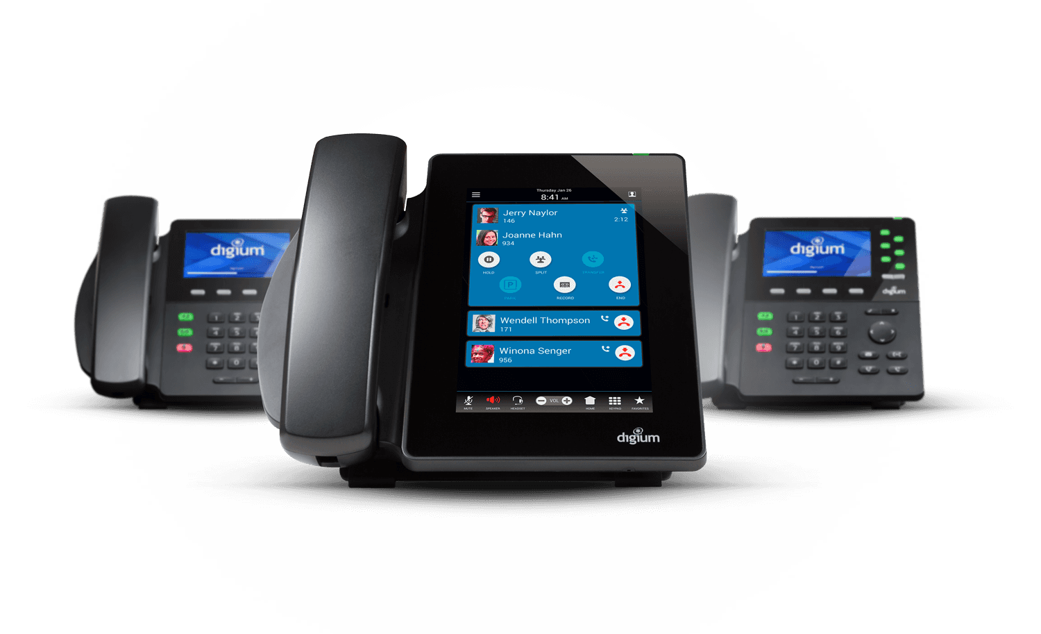
The Digium D-series was a direct challenge to 40 years of desk phone convention — starting with the D80, a completely touch-driven device with zero physical buttons. I led UX from concept through shipping: defining the touch interaction model, architecting the on-screen application suite, and designing every workflow from visual voicemail to call parking to user presence. With no competitor to benchmark against, every decision had to be justified from first principles.
The hardest problem wasn't designing a touchscreen — it was ensuring users who'd never used one didn't miss the buttons. The solution was a context-sensitive UI that surfaced exactly what users needed at each moment, eliminating the cognitive load of a traditional button matrix.
When Sangoma acquired Digium, the D-series UI design language I had established became the foundation for the next-generation P-series — updated hardware running on Android, with physical volume and navigation keys added alongside the touchscreen for users who preferred tactile controls. The P370, the executive flagship at 7" 1280×800 IPS with built-in Bluetooth and WiFi, carried the same interaction model forward. The same application suite, the same visual system, refined for newer hardware. The design was coherent enough to survive a company acquisition and a hardware refresh with minimal changes — which is its own measure of success.
Process · The Phone Lab
Delivering a consistent experience across the D-series and P-series families — each model with different screen sizes, color depths (8 to 24-bit), and GUI frameworks (FLTK on low-end models, Qt on mid-range, Android on the D80 and P-series flagships) — required building dedicated infrastructure. The company already maintained a competitor sample lab; I used that as a starting point and proposed building a parallel lab specifically for UI and UX design validation.
The lab grew to include all five of our phone models, three popular competitor devices, our two headphone models, and sidecars for our top-tier phones — connected via a local network and PBX. This let us walk through the full onboarding experience on real hardware: language selection, phone registration, extension setup, calls, and transfers.
Two discoveries came directly from running phones continuously in realistic conditions. First, our low-end small-screen models didn't render drop shadows and gradients cleanly — we simplified the UI for that tier, which actually improved clarity for all users on that device. Second, screens would flash briefly and unpredictably throughout the day. Engineers traced it to the phones updating every contact unnecessarily on each sync cycle, taxing the OS. Without the lab, this would have shipped as a customer complaint.
To simulate scale — large call volumes and company-wide conference calls that a physical rack couldn't reproduce — we repurposed a load-testing utility built by our senior engineer, adapting it to simulate over 100 concurrent calls.


Each model presented unique challenges. Different sized displays from different manufacturers, multiple BLF key configurations, and a buttonless touch only model.


Each phone model ran a different underlying GUI framework — FLTK, Qt, and Android — with our mobile apps on iOS and Android as well. A design decision that worked in one framework required a completely different implementation in another. To maintain consistency, I proposed and helped establish a tokenized color system, defining values once and mapping them to each environment's implementation via a separate specification document. It gave engineers a single source of truth regardless of which framework they were working in.
On our smaller, budget-conscious models, screen real estate and processing power were both limited. After reading about icon fonts, I proposed replacing our custom icon set with an icon font system. Engineering implemented it, and the change delivered three benefits at once: reduced storage footprint, improved system responsiveness — making the UI feel noticeably snappier — and eliminated localization ambiguity that had crept into some of our illustrated icons. One idea that solved a design problem, a performance problem, and an internationalization problem simultaneously.


My biggest challenge at Betterview wasn't learning the design tools — it was developing domain expertise in insurance underwriting fast enough to contribute meaningfully to a highly specialized product. I built that knowledge through an executive summit in my first week, ongoing underwriter roundtables, and one-on-one interviews with end users. That understanding shaped every design decision across three years of feature development.
At my first summit — 30+ insurance carrier executives — a single requirement emerged that defined the next phase of our work: underwriters needed to complete a full roof assessment in 90 seconds.
The Problem · Hidden Data & Lost Users
Critical risk scores were buried under third-party partner tabs. Underwriters were leaving our product mid-task — going to Yelp for neighborhood context, Zillow and Google Maps for property visuals. We redesigned the landing page to surface primary risk indicators immediately, gave company admins the ability to customize the data hierarchy by region and risk type, and integrated street view and real estate imagery directly into the report. Assessment times dropped to as low as 45 seconds. Users stopped leaving.

Feature · Spotlight Editor & Drawing Tool
The original drawing tool didn't follow standard pen tool conventions — users had to activate an edit mode before they could draw, rather than clicking the tool icon and working immediately. I redesigned the Spotlight Editor from the ground up: the tool activates on click, undo is available throughout, and users can categorize each detection (staining, rust, missing shingles, debris, and more) to help train our AI model for more accurate future scoring.
Guardrails were essential. The tool includes inline error banners and modal validation that prevent impossible categorizations — for example, flagging rust on an asphalt shingle roof before it reaches the ML pipeline. A confirmation panel lists all spotlights marked for deletion and added for rescore before the user commits. Nothing reaches the machine learning team without being reviewed and validated first.


I designed the complete Defensible Space assessment system as a solo project, building the visual and data architecture from California's regulatory guidelines for wildfire defensible space. The system uses color-coded aerial overlays to show vegetation zones, other structures, and yard debris within Zone 0, Zone 1, and Zone 2 buffers around each building. The right panel surfaces sq footage and percentage coverage per zone per building — giving underwriters the quantitative data to assess wildfire survivability without leaving the product. The feature became substantial enough to warrant its own dedicated PDF export format alongside the Summary and Complete report types.

Feature · Changes Panel
I owned design and delivery of the Changes panel — a temporal comparison view that lets underwriters see exactly how a property's condition has changed between any two imagery dates. A split-screen aerial view with a scrubable timeline sits alongside a structured table showing detection-by-detection deltas: percentage change, square footage, and change direction for every condition type across every building. This turned historical imagery from a passive reference into an active risk signal.


As Betterview's AI team expanded the product's detection capabilities, I designed the UX for an expanding suite of features: the Measurements tool (evolved from lessons learned in the drawing tool), a Map layer interface, the Exposure panel surfacing wind, hail, hurricane, wildfire, tree fall, flood, and crime risk from multiple data providers, the Changes panel temporal comparison view, responsive navigation specifications for engineering handoff, and detections for trees, wildfire path modeling, yard debris classification, and pool identification. Each feature required translating a new data model into an interface that insurance professionals could act on quickly and confidently.


Initiative· Heap Product Analytics
I identified a gap in our ability to make evidence-based design decisions — our Business Intelligence team was overloaded, and existing analytics tools were too complex for the reports we actually needed. I researched alternatives and proposed Heap as a purpose-fit solution. After getting buy-in, I configured our reports, made Heap access available across the team, and ran three to four lunch-and-learn sessions with four to five attendees each — including data annotation, product managers, and customer support.
At a company-wide retreat, the VP introduced our product analytics initiative to the organization and called on me directly with questions. I pulled a live report within a minute. The Heap adoption reduced our dependency on the BI team for routine design validation, freeing both teams to focus on higher-value work. Session replay data from Heap also directly validated the Spotlight Editor redesign — confirming the new interaction model was working before we fully shipped.


Process · Narrated Prototype Handoffs
Written specs have limits — nuances get skipped, language barriers obscure intent on multinational teams, and distributed time zones make live walkthroughs impractical. My handoff process used the OS's native screen recorder to narrate over Figma prototypes wired with only the essential interactions. The narration explained not just what the UI does, but why — the intent behind each decision, pitfalls to avoid, edge cases to handle.
Engineers watched at their own convenience and referenced recordings throughout development. Product managers used them to gather stakeholder feedback without scheduling a session. Because recordings were produced early — before designs were fully resolved — viewers felt invited into the process rather than presented with finished decisions. Teams that had watched the walkthrough built with more confidence and asked fewer clarifying questions. The design didn't just get handed off. It got understood.
Brand & Experience: Designing Belonging

The best design work I did before UX was called UX was at Affinity Development Group, where I was the lead designer on Ford Motor Company's customer relationship programs for two enthusiast clubs — Team Ford Racing and the SVT Owners Association. Working directly with Ford stakeholders, I was responsible for every touchpoint a member encountered: the mailer that recruited them, the kit that welcomed them, the magazine that kept them engaged, and the event graphics that made them feel like insiders at the track.
The work wasn't called experience design at the time. But designing the acquisition-to-onboarding-to-retention journey for a passionate community is exactly that — just expressed in ink, cardstock, embroidery, and pit passes rather than pixels.
The new member welcome kit was conceived as a model kit unboxing experience — a nod to automotive nostalgia that immediately signaled to the recipient that this wasn't a generic club membership. Inside: an embroidered hat, t-shirt, personalized membership card, stickers, enamel pin, and their first issue of the bi-monthly magazine. Every element was branded for a motorsports enthusiast. The sequencing and presentation of the contents were considered — the physical experience of opening the kit was the first impression of membership.


Membership acquisition was driven by personalized offer letters mailed to interested prospects and new Ford vehicle purchasers. We tested three price points — $19.99, $24.99, and $29.99 — by varying the offer letter sent to different segments. The results confirmed $24.99 as the optimal price: high enough to signal value, accessible enough to convert. The creative adapted accordingly.


Both clubs received a bi-monthly magazine — SVT Enthusiast for SVTOA and Inside the Oval for TFR — six issues per year each, twelve total annually. The deliberate design decision was to give each publication a completely distinct visual identity, so they appeared to come from different design studios. Same designer, different worlds. This required maintaining two separate editorial aesthetics, managing member photo submissions (and retouching the poor-quality ones for print), coordinating with an editor in Michigan, and assembling final press files on deadline.


Skills & Background
About Robert
I'm Robert Garbowski — a Senior UX/UI Designer based in San Diego with 14 years of experience designing products at the boundary of hardware and software. I hold an MFA from the School of the Art Institute of Chicago, and I bring the rigor of fine arts training together with the pragmatism of someone who has shipped embedded firmware UI to real businesses.
At Digium/Sangoma, I led UX on the D80 — the industry's first fully button-free executive desk phone — and the P-series family. I worked directly with hardware engineers and firmware developers, designing within display, power, and processing constraints that most UX designers never encounter, while maintaining consistency across multiple GUI frameworks through a tokenized design system I helped establish.
At Betterview, I moved into data-dense SaaS — designing for insurance professionals who needed to trust AI assessments with real financial consequences. I was embedded in customer research from day one, presenting at executive summits and running underwriter roundtables to validate design decisions with the people who used the product daily.
Before deep-diving into tech products, I worked with brands including Ford, Disney, Red Bull, Dish Network, Schwinn, and MotorTrend — a range that trained my ability to understand any audience, match any aesthetic, and design with serious commercial intent.
I was born and raised in Connecticut, the son of Polish immigrants — I'm fluent in the language and familiar with the culture. Outside of design, I play drums in several San Diego bands, cook for my wife and daughter, and have been known to name untitled artworks in museums. I wear colors besides black.
Education
Master of Fine Arts
School of the Art Institute of Chicago
Bachelor of Arts
Central Connecticut State University, New Britain CT
Core UX Disciplines
Specializations
Tools & Methods
Work Experience
2025
Sangoma Technologies — San Diego, CA
Senior UX & Interface Designer (Contract)
Returned to Sangoma as a senior contract designer — brought back for established expertise in the product line and hardware-software UX, continuing design leadership across administration panels, mobile apps, and hardware devices.
Designed P370 executive flagship and unified P-series design language spanning five phone tiers (P310–P370), maintaining design coherence while scaling features from entry-level to executive
2021 — 2024
Betterview (Now Nearmap) — San Diego, CA
Senior UI Designer
Designed new features and improvements for Betterview's AI-powered property intelligence platform — a SaaS product serving 200+ P&C insurance carriers. Worked within a two-person design team, owning individual features and modules as the AI team expanded the product's detection capabilities. My primary challenge was developing deep domain expertise in insurance underwriting fast enough to design with authority in a highly specialized field.
Presented at an annual executive summit with 30+ insurance carrier directors in my first week, brought in directly by the VP of Technology — built ongoing domain knowledge through roundtables and one-on-one underwriter interviews
Redesigned the report landing page to surface critical risk indicators immediately — confirmed assessment times as low as 45 seconds against a 90-second business requirement, validated through Heap session analytics and video screen replays
Designed customizable admin data hierarchy allowing carriers to promote region-specific risk data (e.g. flood for coastal states, wildfire for California) to primary view
Eliminated underwriter dependency on Zillow, Yelp, and Google Maps by integrating street view and real estate imagery directly into the product
Sole designer on the Defensible Space wildfire assessment system — built visual zone architecture and data panel to California regulatory guidelines for Zones 0, 1, and 2
Designed and delivered the Changes panel — temporal split-imagery comparison with detection delta table showing condition changes between any two imagery dates
Redesigned the Spotlight Editor drawing tool — fixed pen tool conventions, added undo, built categorization system for AI training data, designed coaching prompts and a validation confirmation step preventing impossible categorizations before ML pipeline submission
Proposed, researched, and drove adoption of Heap for product analytics — reduced Business Intelligence team dependency, ran lunch-and-learn sessions cross-functionally, demonstrated live reporting to company leadership at an all-hands retreat
Developed narrated Figma prototype recording system for engineering handoff — async walkthroughs used by distributed teams across time zones; adopted by PMs for stakeholder feedback gathering
Contributed to feature design for CAT Response damage assessment, Exposure panel (wind, hail, hurricane, wildfire, tree fall, flood), Measurements tool, responsive navigation, pool detection, tree detection, and wildfire path modeling
Created Figma responsive navigation specification documents for engineering handoff at defined breakpoints
2011 — 2021
Digium / Sangoma Technologies — San Diego, CA
Lead UX & Interface Designer
Led UX across Sangoma's entire product line for a decade — spanning hardware devices, firmware UI, mobile apps, and web-based administration platforms. Worked in a cross-functional team of under a dozen alongside hardware engineers, firmware developers, and product management. Managed junior designers including task assignment, progress check-ins, and design review before stakeholder presentations.
Designed the D80 — industry's first fully button-less, touch-only executive desk phone — defined touch interaction model, UI architecture, and complete application suite with no competitor to benchmark against
Designed P370 executive flagship and unified P-series design language spanning five phone tiers (P310–P370), maintaining design coherence while scaling features from entry-level to executive
Proposed and built a dedicated UX phone lab — all five production models, three competitor devices, headphones, and sidecars on local network and PBX — caught two critical pre-ship issues: gradient rendering failure on low-end models and OS-taxing contact sync bug causing screen flashing
Established a tokenized color system and multi-framework specification document maintaining design consistency across FLTK (Fast Light Toolkit, used on low-end models), Qt (mid-range), Android, iOS, and Android GUI environments simultaneously
Proposed replacing bitmap icon set with an icon font system after independent research — solved a performance bottleneck, storage constraint, and localization issue in a single implementation
Designed Switchboard attendant console and Switchvox administration portal; identified unexpected TV display deployment use case post-launch and redesigned subsequent widgets for legibility at distance
Created SIP mobile apps for iOS and Android following Apple HIG and Material Design guidelines
Developed narrated Figma prototype recording system for engineering handoff — effective for multinational distributed teams across time zones and language barriers
2006 — 2011
Freelance Design Studio — San Diego, CA
Art Director / Principal
Operated an independent design practice serving Fortune 500 companies and regional brands across direct mail, brand identity, editorial design, and digital campaigns. Managed client relationships, project timelines, and production from brief to delivery as sole proprietor.
Executed multi-campaign direct response programs for Dish Network spanning self-mailers, outer envelopes, and dimensional formats including a popcorn box envelope and check-styled offer letter designed to increase open and response rates
Designed brand identity, product logos, and direct mail campaigns for Five Point Capital across engagements lasting 6 months to 3 years
Created full brand ecosystem and collateral for Energy Inspectors — logo, program certification marks, trade show graphics, and marketing materials — for an EPA Partner of the Year company operating across 18 states
Produced album artwork and CD/DVD packaging for San Diego Music Award nominees including Berkley Hart, Charlie Imes, Citizen Band, and SweetTooth
2001 — 2006
Affinity Development Group — San Diego, CA
Senior Designer — Ford Motor Company Account
Lead designer on Ford Motor Company's customer relationship programs, responsible for creating and maintaining brand identity across all communications for two distinct enthusiast clubs — Team Ford Racing (TFR) and SVT Owners Association (SVTOA). Presented directly to Ford stakeholders throughout the engagement.
Designed the new member welcome kit for both clubs, conceived as a model kit unboxing experience — embroidered hat, t-shirt, personalized membership card, stickers, enamel pin, and first issue of the bi-monthly magazine
Conducted price testing via personalized offer letters across three price points ($19.99, $24.99, $29.99) — confirmed $24.99 as the optimal acquisition price
Designed and produced 6 issues per year of two distinct magazines — SVT Enthusiast and Inside the Oval — intentionally crafted with separate visual identities so they appeared to come from different design studios
Managed member photo submissions for print publication, restoring and retouching poor-quality images to meet print standards
Produced event graphics for NASCAR hospitality suites and SVTOA track day experiences — banners, table skirts, pit passes, event schedules, and promotional collateral
Collaborated with an editor in Michigan and coordinated assets, advertisements, and member contributions for each editorial cycle
1998 — 2001
Cyberworks — San Diego, CA
Senior Designer — Web & Digital
Part of a web development team conceptualizing and executing design solutions for a wide range of clients. Responsibilities spanned design presentations, writing briefs, photo editing, directing illustrators, and overseeing production and maintenance of client websites.