D-Series & P-Series: A Decade of Phone UX — From the First Buttonless Desk Phone to a Next-Generation Family

Digium · Sangoma Technologies · 2011–2021 · 2025


The Digium D-series was a direct challenge to 40 years of desk phone convention — starting with the D80, a completely touch-driven device with zero physical buttons. I led UX from concept through shipping: defining the touch interaction model, architecting the on-screen application suite, and designing every workflow from visual voicemail to call parking to user presence. With no competitor to benchmark against, every decision had to be justified from first principles.
The hardest problem wasn't designing a touchscreen — it was ensuring users who'd never used one didn't miss the buttons. The solution was a context-sensitive UI that surfaced exactly what users needed at each moment, eliminating the cognitive load of a traditional button matrix.
When Sangoma acquired Digium, the D-series UI design language I had established became the foundation for the next-generation P-series — updated hardware running on Android, with physical volume and navigation keys added alongside the touchscreen for users who preferred tactile controls. The P370, the executive flagship at 7" 1280×800 IPS with built-in Bluetooth and WiFi, carried the same interaction model forward. The same application suite, the same visual system, refined for newer hardware. The design was coherent enough to survive a company acquisition and a hardware refresh with minimal changes — which is its own measure of success.
Process · The Phone Lab
Delivering a consistent experience across the D-series and P-series families — each model with different screen sizes, color depths (8 to 24-bit), and GUI frameworks (FLTK on low-end models, Qt on mid-range, Android on the D80 and P-series flagships) — required building dedicated infrastructure. The company already maintained a competitor sample lab; I used that as a starting point and proposed building a parallel lab specifically for UI and UX design validation.
The lab grew to include all five of our phone models, three popular competitor devices, our two headphone models, and sidecars for our top-tier phones — connected via a local network and PBX. This let us walk through the full onboarding experience on real hardware: language selection, phone registration, extension setup, calls, and transfers.
Two discoveries came directly from running phones continuously in realistic conditions. First, our low-end small-screen models didn't render drop shadows and gradients cleanly — we simplified the UI for that tier, which actually improved clarity for all users on that device. Second, screens would flash briefly and unpredictably throughout the day. Engineers traced it to the phones updating every contact unnecessarily on each sync cycle, taxing the OS. Without the lab, this would have shipped as a customer complaint.
To simulate scale — large call volumes and company-wide conference calls that a physical rack couldn't reproduce — we repurposed a load-testing utility built by our senior engineer, adapting it to simulate over 100 concurrent calls.


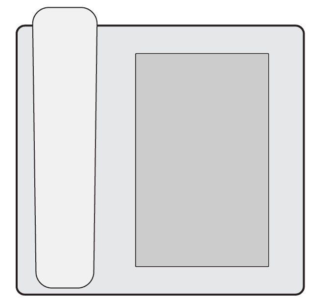
Each model presented unique challenges. Different sized displays from different manufacturers, multiple BLF key configurations, and a buttonless touch only model.


Process · Cross-Framework Design Consistency
Each phone model ran a different underlying GUI framework — FLTK, Qt, and Android — with our mobile apps on iOS and Android as well. A design decision that worked in one framework required a completely different implementation in another. To maintain consistency, I proposed and helped establish a tokenized color system, defining values once and mapping them to each environment's implementation via a separate specification document. It gave engineers a single source of truth regardless of which framework they were working in.
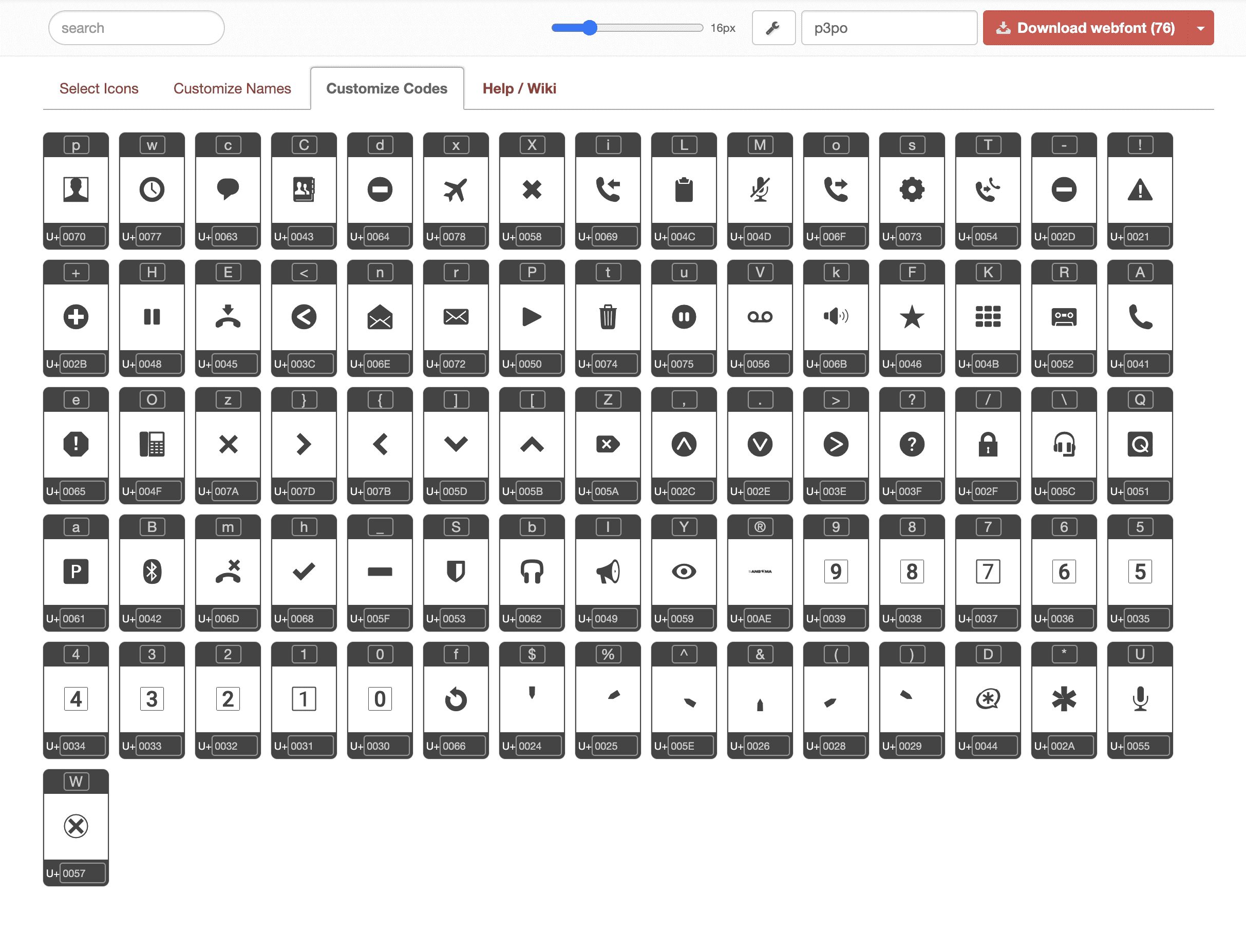
On our smaller, budget-conscious models, screen real estate and processing power were both limited. After reading about icon fonts, I proposed replacing our custom icon set with an icon font system. Engineering implemented it, and the change delivered three benefits at once: reduced storage footprint, improved system responsiveness — making the UI feel noticeably snappier — and eliminated localization ambiguity that had crept into some of our illustrated icons. One idea that solved a design problem, a performance problem, and an internationalization problem simultaneously.


Each model presented unique challenges. Different sized displays from different manufacturers, multiple BLF key configurations, and a buttonless touch only model.


