Team Ford Racing & SVTOA: Designing Membership as an Experience
Affinity Development Group · Ford Motor Company · 2001–2006

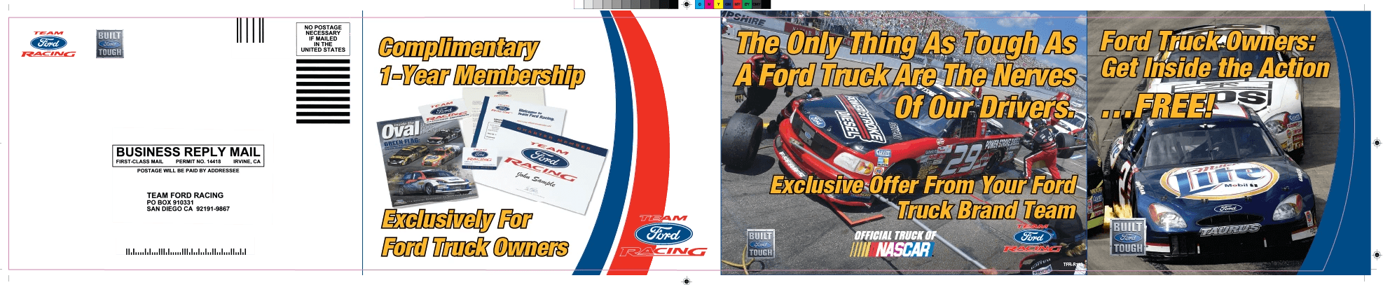
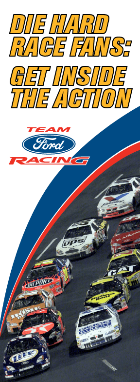
The best design work I did before UX was called UX was at Affinity Development Group, where I was the lead designer on Ford Motor Company's customer relationship programs for two enthusiast clubs — Team Ford Racing and the SVT Owners Association. Working directly with Ford stakeholders, I was responsible for every touchpoint a member encountered: the mailer that recruited them, the kit that welcomed them, the magazine that kept them engaged, and the event graphics that made them feel like insiders at the track.
The work wasn't called experience design at the time. But designing the acquisition-to-onboarding-to-retention journey for a passionate community is exactly that — just expressed in ink, cardstock, embroidery, and pit passes rather than pixels.
The Welcome Kit · Unboxing as Onboarding
The new member welcome kit was conceived as a model kit unboxing experience — a nod to automotive nostalgia that immediately signaled to the recipient that this wasn't a generic club membership. Inside: an embroidered hat, t-shirt, personalized membership card, stickers, enamel pin, and their first issue of the bi-monthly magazine. Every element was branded for a motorsports enthusiast. The sequencing and presentation of the contents were considered — the physical experience of opening the kit was the first impression of membership.


Price Testing · Data Informing Design
Membership acquisition was driven by personalized offer letters mailed to interested prospects and new Ford vehicle purchasers. We tested three price points — $19.99, $24.99, and $29.99 — by varying the offer letter sent to different segments. The results confirmed $24.99 as the optimal price: high enough to signal value, accessible enough to convert. The creative adapted accordingly.


Two Magazines · One Designer · Intentionally Different
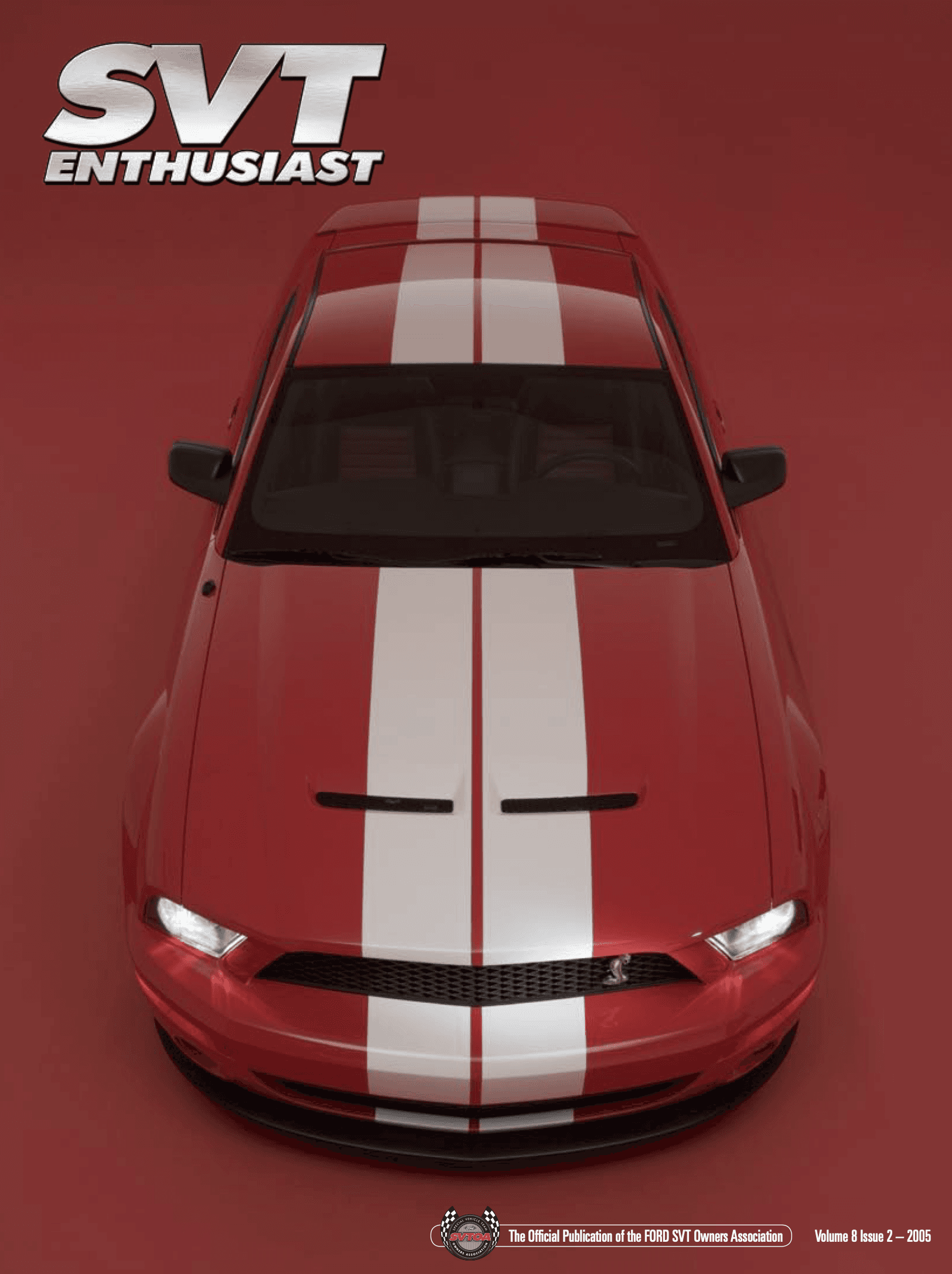
Both clubs received a bi-monthly magazine — SVT Enthusiast for SVTOA and Inside the Oval for TFR — six issues per year each, twelve total annually. The deliberate design decision was to give each publication a completely distinct visual identity, so they appeared to come from different design studios. Same designer, different worlds. This required maintaining two separate editorial aesthetics, managing member photo submissions (and retouching the poor-quality ones for print), coordinating with an editor in Michigan, and assembling final press files on deadline.